Didot-style designs are reminiscent of late-18th and early-19th century serif faces created by and for the Didot printing family in France. Generally, the term “Didot-style” brings very high-contrast designs to mind. Usually, letters in those fonts have thick vertical stems and hairline-thin horizontal strokes. In particular, the horizontal strokes forming the typefaces’ serifs are quite light. Today, we often see Didot-style faces used in fashion contexts. Whether the Didot style has something intrinsically “elegant” about it or whether haute couture branding simply began in the mid-nineteenth century when the Didot style was a particular staple of French printing is a matter of ongoing discussion. I have no answers to provide there, but readers looking for more information on the subject should check out Elisabeth Carey Smith’s Type in Couture article and Craig Eliason’s lecture, Didot and Fashion.
Kalgoorlie-Boulder rannsóknarréttur Elizabeth Anspach 266 Ross Pkwy
Ján Josef Rösler Le Kremlin-Bicêtre 448 Middle Field C/94 technologickému
skeiðarársandur Pasquale Anfossi 690 Brown Trek E/58 counterpicketed
boulevardpresse Willem de Fesch Tabernas Desert 748 Lonely Round
If you search Fontstand for Didot typefaces, our service returns 47 results as of this writing. Those results include typefaces with the word “Didot” in their names – like Plinc Beaux Arts Didot – as well as typefaces that do not, including Jean François Porchez’s Ambroise, based in part on types Michel Vibert cut for a Didot family member around 1830. The results also include fonts based on historical typefaces with a similar look that were made around the time the Didots were active. That includes František Štorm’s Baskerville Original, which revives John Baskerville of Birmingham’s mid-18th century work, as well as PS Fournier, which I recently reviewed.
Clicking on our keyword “Didone” returns somewhat even results. A portmanteau of “Didot” and “Bodoni,” this type classification term is shorthand for high-contrast typefaces based on late-18th and early-19th century models (the “Bodoni” in Didone is Giambattista Bodoni; see the Parmigiano families for fonts based on his work). Finally, Fontstand will return even more typefaces of the kind this paragraph mentions when you filter by the Modern serif category. Modern? Well, all historical typographic styles were contemporary once: when Didot-style typefaces were new, the term “Modern” was applied to them and it must have stuck ever since.
Let’s now come to Plinc, an abbreviation for Photo-Lettering, Inc. – a New York City photo-typesetting house operating from 1936 through 1997. The company’s typesetting services created unique headlines. These were composed on the fly using the firm’s extensive collection of typefaces. For years, the Photo-Lettering staff helped define how New York City advertising design looked. They set trends that held for decades and were followed in many parts of the world. One of Photo-Lettering’s many type designs was Galax Didot, first published in the company’s 1965 catalog. C. E. “Les” Coryn drew the high-contrast serif. The design was revised in the 1970s, and its name changed accordingly: Photo-Lettering redubbed it Galaxy. Galaxy! So appropriate for the Space Age.
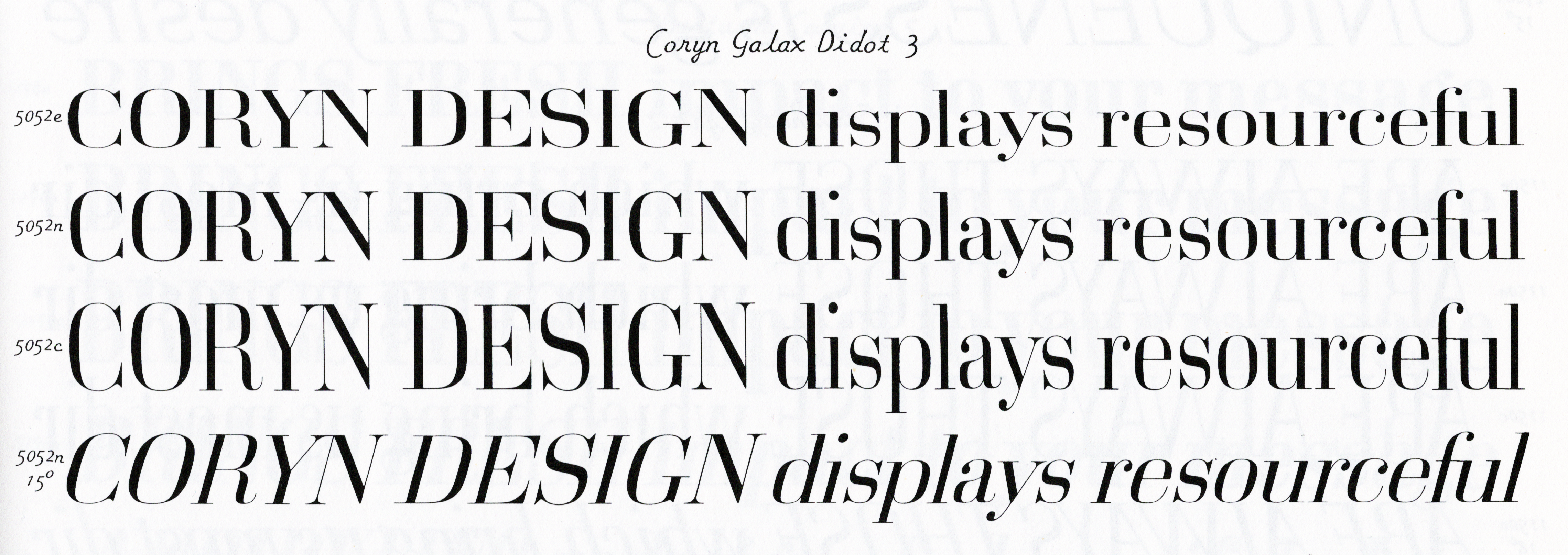
Coryn Galax Didot type specimen, shown in Photo-Lettering’s 1965 Alphabet Thesaurus. The typeface’s design is in the second of the four rows (preceded by “5052n”). The type design could also be set extended – as shown in the first row – or condensed or slanted, as the bottom two rows illustrate.
At the beginning of the 21st century, House Industries purchased Photo-Lettering’s physical assets. Those included the master photograph negatives for the Photo-Lettering typefaces. House Industries collaborated with several designers to translate those masters into digital fonts. Plinc Coryn Galaxy is Tânia Raposo’s digitization of Coryn’s design (on the House Industries website, this design has the shorter name Coryn Didot). Plinc Coryn Galaxy is one of 24 Photo-Lettering typefaces on Fontstand.
The biggest difference between Plinc Coryn Galaxy and the letters the Didot family used in their printing is one of proportion. The widths of Plinc Coryn Galaxy’s letters are regularized. The difference between a capital “H” and an “O” is not as great as it would have been in a Didot foundry type. Plinc Coryn Galaxy’s “O” feels slightly narrower than might be typical. The lowercase “c” and “o” have similar widths, giving the “c” something wide about it. The Didots’ typefaces featured round letterforms with broader, more circular forms. Coryn’s letters feature squared circles instead. They feel at home with superellipse typefaces from the 1950s and ’60s, like Alessandro Butti and Aldo Novarese’s Eurostile, or Hermann Zapf’s Melior. Without a doubt, Plinc Coryn Galaxy’s widths – plus the way its rounds are drawn – make this feel like the 1960s, not the 1820s.
A result of Plinc Coryn Galaxy’s regularized character widths is comparatively wide-feeling numerals. The numerals’ wide stance is helped by their being slightly shorter than the typeface’s capital letters. On the other hand, the lowercase letters’ ascenders come up to the same height as the tops of the capitals. Like the other Plinc typefaces, Plinc Coryn Galaxy is intended for use in large sizes. It is a display typeface for headlines, posters and logos, etc. Accordingly, the spacing between its characters is tight. Matching the heights of ascenders and capital letters isn’t a strictly display type feature per se, but it does separate Plinc Coryn Galaxy from Didot-style typefaces optimized for book design. Another display-type feature is the hairline-thin design used for most of the typeface’s diacritics. They might almost disappear at small sizes, but that isn’t where this typeface would shine anyway.
Correction
After this review was published, Craig Eliason reached out to mention that, in his research into “Modern” types, he found that the “Modern” label only arose in response to the Old Style serif revival in the later 19th century. As he put it, Modern typefaces were already around for generations before they became known as “Modern.”