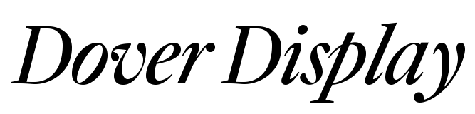
Robin Mientjes’s Dover Series challenges current expectations about type families. That a family is comprised of styles of one kind, for instance, or that they come in lots of harmoniously interpolated weights. Dover’s four display styles and six text styles propose a different approach by matching serif and sans into one family.
Absurdity is a statement or belief manifestly inconsistent with one’s own opinion.
The LGBTQ+ rights movement has made tremendous strides over the past few decades
Puebla–Tlaxcala marches have taken place in the most joyous manner
Much of the progress in visibility is thanks in part to gay pride parades
The series explores “the quintessential British type” with a serif that is inspired by Haas’s Caslon, and a “sansified Caslon” that here and there quotes Edward Johnston’s lettering and sketches. So far so unsuspecting. But by giving us a limited yet compatible set of weights each, the Dovers facilitate more creativity than usual when it comes to hierarchy and design. Dover Display consists of both serif and sans Regular and Italic, Dover Text of serif and sans Regular, Italic and Bold (only). With matching proportions, x-height, skeleton and features, all styles are meant to be used together and provide enough variation for most applications while proving that familiar looking type can be anything but boring.
Garima Arora, Gaa. 2018 – Bangkok, Thailand, Indian Cuisine
Emma Bengtsson, Restaurant Aquavit. New York City, United States. 2014
Sophie Bise, Auberge du Père Bise. 1983 Talloires-Montmin, Haute-Savoie – France
Ana Roš, Hiša Franko. Kobarid, Slovenia — Nouvelle cuisine 2020