The typefaces from a handful of sixteenth-century French punchcutters remained favorites among Western European printers and publishers for centuries after they first appeared. And, about a century ago, multiple typefoundries and typesetting-machine manufacturers “revived” those types. Generally, the revival process saw the designing of new typefaces reminiscent of the old classics. Reviving was rarely straightforward. Many of the French Renaissance punchcutters had cut various types over a range of sizes. They also cut types for several decades. The letters in a typeface cut at one size would not necessarily match those in all others. Revivals tended to smooth things out, creating more even letterforms that did not change very much from size to size.
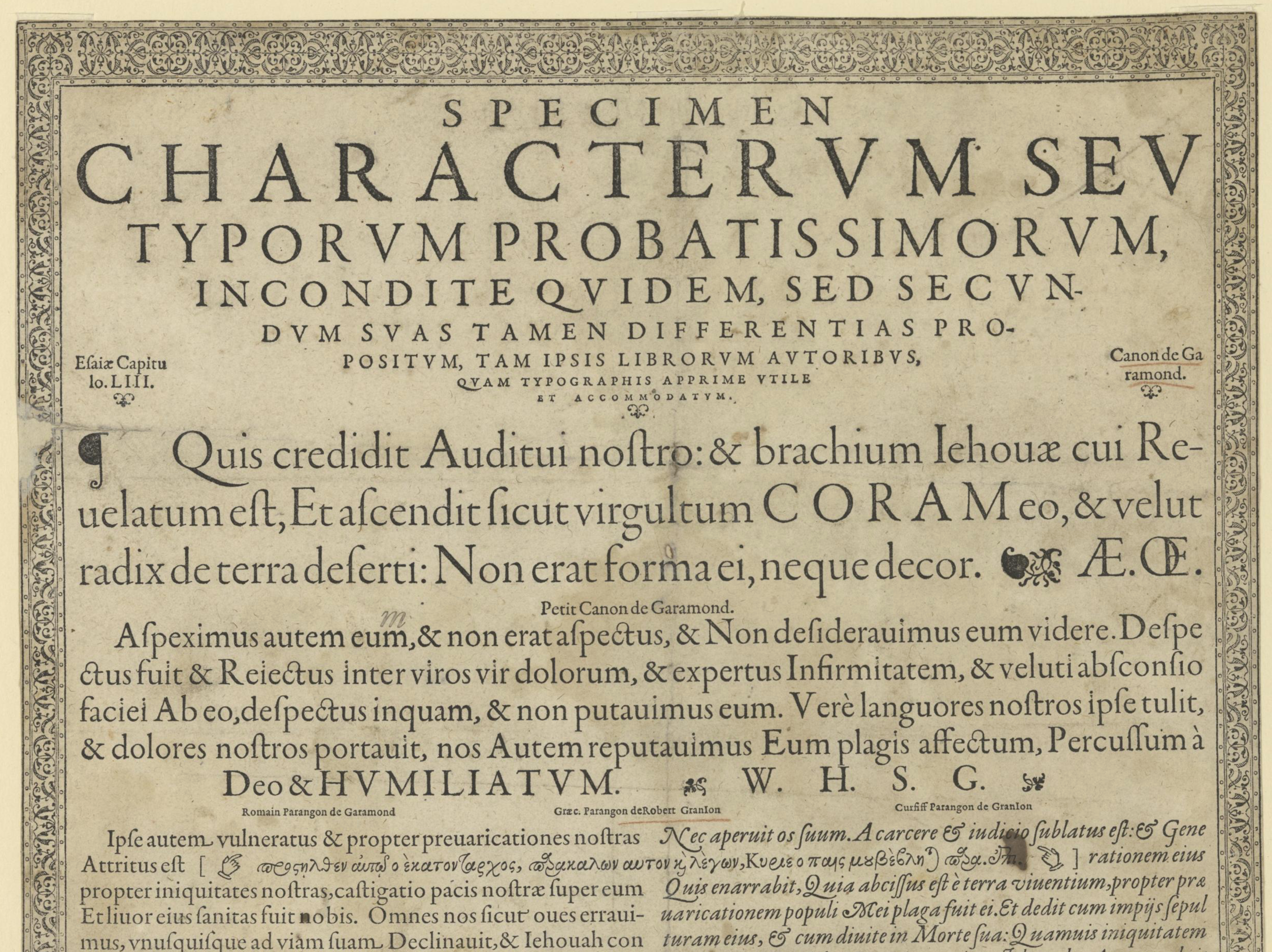
The 1592 specimen from the Egenolff-Berner typefoundry in Frankfurt, digitized by the Universitätsbibliothek Johann Christian Senckenberg, Frankfurt am Main. Claude Garamond cut about half the types visible in this cropping. As for the rest? Jacob Sabon worked over the Garamond capitals in the second line, and Robert Granjon cut the “Petit Canon de Garamond.” Granjon also cut the Greek and Italic types. This broadsheet may be the most famous specimen of Garamond, Granjon, Sabon and Pierre Haultin’s typefaces. Many type designers consulted it when developing Garamond revivals, including the Stempel foundry’s Rudolf Wolf, Adobe’s Robert Slimbach, and Jean François Porchez.
The question of how those revival typefaces should be named proved difficult. Many of them have “Garamond” in their typeface names – although some of the most widely-used twentieth-century Garamonds like ATF Garamond and Monotype Garamond were not based on Claude Garamond’s work at all, but rather on the types from a seventeenth-century punchcutter named Jean Jannon. Even in the families like Stempel Garamond that were based directly on Claude Garamond’s oeuvre, his inspiration only flowed into the upright fonts. The italic designs look to types from another punchcutter: Robert Granjon. And at least one of the twentieth-century’s most faithful Garamond–Granjon revivals – Sabon – wasn’t named after either punchcutter.
Aspeximus autem eum, & non erat aspectus, & Non desiderauijus eum videre. Despectus fuit & Reiectus inter virus vir dolorum, & expertos Infirmitatem,
Nec aperuit os suum. A carcere & iudicio sublatus est: & Gene rationem eius Quis enarrabit, Quia abcissus est è terra viuentium, propter præuaricationem populi Mei plaga fuit ei.
Verè languores nostros ipse tulit, & dolores nostros portauit, nos Autem reputauimus Eum plagis affectum, Percussum à
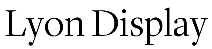
Many typefaces with “Garamond” in their names come from twentieth-century typesetting-equipment companies: type foundries, hot-metal typesetting and phototype machine manufacturers, and software developers, too. Throughout the last century, book designers have favored Garamond-style typefaces. Yet, one also finds the fonts used for setting magazines’ text, and even in a few newspapers. There’s a good chance that Garamond-style typefaces will continue to play an almost “default” role in texts intended for immersive reading, especially in print. Since they were designed for on-screen reading environments, twenty-first-century typefaces like R-Typography’s Chassi or Commercial Type’s Lyon – each based on French Renaissance models – may prove just as popular online as last century’s Garamonds did for books. This very website is set with Lyon Text, for instance.
abcdefghijklmnopqrstuvwxyzABCDEFGHIJKLMNOPQRSTUVWXYZabcdefghijklmnopqrstuvwxyz
abcdefghijklmnopqrstuvwxyzABCDEFGHIJKLMNOPQRSTUVWXYZabcdefghijklmnopqrstuvwxyz
abcdefghijklmnopqrstuvwxyzABCDEFGHIJKLMNOPQRSTUVWXYZabcdefghijklmnopqrstuvwxyz
abcdefghijklmnopqrstuvwxyzABCDEFGHIJKLMNOPQRSTUVWXYZabcdefghijklmnopqrstuvwxyz
abcdefghijklmnopqrstuvwxyzABCDEFGHIJKLMNOPQRSTUVWXYZabcdefghijklmnopqrstuvwxyz
If we compare the regular upright fonts from five of the “Garamond”-style typefaces currently on Fontstand, we see more similarities than differences. Sure, the typefaces do not share the same design, but we notice their individuality in the terminals or the relative tightness of their spacing most. They all include letterforms that look generally similar. The most visible skeletal differences between the typefaces shown above are not in their letters’ comparative shapes but their differing x-heights, as well as the lengths of the ascenders and descenders. Galien’s g may descend more than Primo Serif’s, but both examples still hew to the “Garamond” model. These typefaces have the letter shapes that most readers of the Latin script have probably been reading most often throughout their lives. Whether or not “Garamond”-style typefaces are intrinsically legible is difficult for me to say, but I doubt that any other kinds of typefaces are more familiar for us.
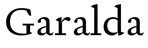
TypeTogether’s Garalda typeface features slab serifs. In smaller type sizes, that is barely noticeable. “Garamond”-style letterforms usually have serifs that are visibly bracketed onto their stems. That bracketing is one of many calligraphic traces still present in most typefaces from the “Garamond” genre; the brackets are transitions made by the writing instrument as it moves from a letter’s stem to its terminals (or serifs). Garalda’s break with this serif tradition is only noticeable when the typeface is used in large sizes. At the sizes most books use for their running text, the exact forms letters’ serifs take are not directly noticeable. A reader can see the shapes, but only if she looks for them explicitly. All in all, Garalda fits just as well within its designer’s body of work as it does in the “Garamond” category. All of Xavier Dupré’s typefaces are overtly calligraphic.
abcdefghijklmnopqrstuvwxyzABCDEFGHIJKLMNOPQRSTUVWXYZabcdefghijklmnopqrstuvwxyz
abcdefghijklmnopqrstuvwxyzABCDEFGHIJKLMNOPQRSTUVWXYZabcdefghijklmnopqrstuvwxyz
abcdefghijklmnopqrstuvwxyzABCDEFGHIJKLMNOPQRSTUVWXYZabcdefghijklmnopqrstuvwxyz
abcdefghijklmnopqrstuvwxyzABCDEFGHIJKLMNOPQRSTUVWXYZabcdefghijklmnopqrstuvwxyz
abcdefghijklmnopqrstuvwxyzABCDEFGHIJKLMNOPQRSTUVWXYZabcdefghijklmnopqrstuvwxyz
When we look at the italics in those same five typefaces, we see italic styles that are visibly more calligraphic than the families’ upright fonts. Some italic fonts in the sample above feature “pothook serifs” as their lowercase letters in-strokes and out-strokes; check out the “n” in Chassi, Galien and Primo Serif, for instance. Garalda’s italic preserves the lowercase letters’ handwritten basis the most. The forms of its “v” and “w” are practically exuberant. They stand out the most in the comparison above.
Antonio Rosetti Los Caños de Meca 262 Susan Mitchell Pkwy připomínajících
La Serna de Iguña Avenida Óscar Salcedo F/88 nepremišljenost encasillamiento
La Serna de Iguña Avenida Óscar Salcedo F/88 nepremišljenost encasillamiento
As of this writing, R-Typography’s Chassi is the newest “Garamond” on Fontstand. Designed by Rui Abreu, it may also be the type family on Fontstand that is closest to Claude Garamond’s oeuvre. Nevertheless, Chassi is not a strict Garamond revival. The sharpness inside many of its letterforms is probably Chassi’s most contemporary trait. For instance, look at the inside of the terminal at the top-left of the “a.” Abreu also added in many nods to Granjon’s types, but also to Jean Jannon’s seventeenth-century letterforms. His italics for Chassi have a lot of Jannon in them. Have a look at the wide bottom bowl of the “g,” for instance, or the top bowl of the “k.” Those are Jannon traits, just like the top of the “C” and the bottom of the “Q.”
Both Claude Garamond’s original types and their twentieth-century revivals were created for book printing, but Chassi is a modern editorial design system. Its design functions very well in longer texts that should be read immersively, but it is an excellent selection for publication design in any media. Chassi is subdivided into three families – S, M and L. Abreu optimized each variant for specific point-size ranges. Chassi L, shown below, is intended for use in headlines. The alphabet-comparison specimens above use Chassi S, the family intended for running text. In addition to more contrast-rich letterforms, Chassi M and Chassi L look a bit more elegant than Chassi S’s fonts. They are also more tightly spaced.
83 Avenue Robin Bocuse veröffentlichung departmentalize Adalbert Gyrowetz
rannsóknarréttur aix-en-provence Franz Xaver Mozart Reinfeld Holstein
Carrer Guillermo E-98 instinctivement Alhaurín el Grande rannsóknarréttur
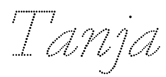
Abreu created Chassi L for use in headlines, and indeed, Claude Garamond and his sixteenth-century contemporaries also created large-sized fonts for printers to use on books’ title pages. Many “Garamonds” include optical sizes, including some mentioned in this article. Jannon has fonts optimized for 10pt use as well as more all-purpose fonts. In addition to Lyon Text, Kai Bernau’s design includes a Lyon Display family. Like Chassi L, Lyon Display’s fonts feature sharper-looking letterforms with a higher degree of contrast. However, the most “display” typeface inspired by the sixteenth-century French Renaissance types currently available through Fontstand must be Tanja, from Paul Barnes and Christian Schwartz. Tanja is a typeface whose letterforms are made up solely of dots. Its design is based on the “1554” styles from their earlier Marian family, a series of monolinear typefaces. Despite being monolinear, Marian’s “1554” styles closely approximate the Garamond and Granjon models, making Tanja a more authentic Garamond-style typeface than one might assume at first glance.
Castro Urdiales Avenida de Girona 99 rannsóknarréttur toastmistresses
dvanáctihodinovou Frédéric Blasius Dorotheerring 40 besitzanzeigend
If you’d like to view the complete digitization of the Egenolff-Berner specimen reproduced at the beginning of this post, you can find it on the Universitätsbibliothek Johann Christian Senckenberg’s website here.