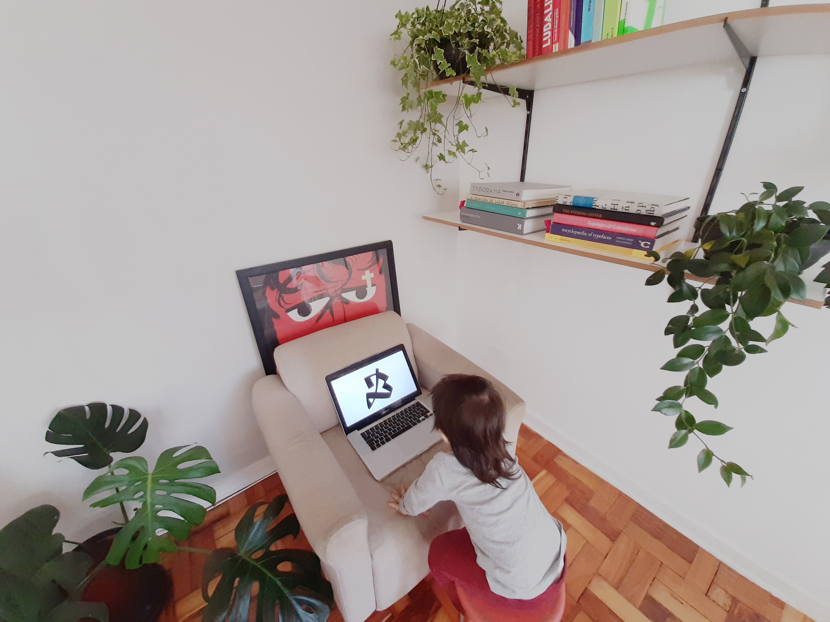
Photo: Daniel Sabino
In 2007 a New York Times travel feature described the city of São Paulo, a sprawling metropolis of over 12 million citizens and the economic capital of Brazil, as “[maybe] the ugliest, most dangerous city you’ll ever love.” When I first visited a year later, this was exactly my experience as I discovered, in the midst of the city’s architectural and social highs and lows, a community of designers warm in their welcome and positive in their pursuit of an emergent passion for type.
The type design “scene” I visited then was, as Daniel Sabino reflects, one still coming to terms with the Brazil of the 2000s, “a country on the periphery of capitalism and without centuries of type design culture.” Things are different now, he says, acknowledging the debt his generation of type designers owes to the early-wave digital experimentation and networks of designers such as Priscila Farias and Eduardo Recife. “Our community is currently emerging from childhood into adolescence, and the typographic culture seems to be much more widespread than 15 or 20 years ago.”
Sabino’s own awakening to the importance of type design dates to a time when he had already graduated and worked for a few years in advertising. Seeking to enhance his professional skills through further study led him to typography classes under designer Gustavo Ferreira, who introduced him to the subtleties of text typefaces. As Sabino puts it, he “ended up falling in love with type design during the course and couldn’t let go.” He found that type design suited him, especially the meditative processes of drawing letters and the control it gave him over all stages, from creation through production to publishing. As he explains, “Most of the time, type designers create products while graphic designers normally provide services, and that makes a big difference. Two crafts similar in their way of thinking but with important differences in their ways of making.”
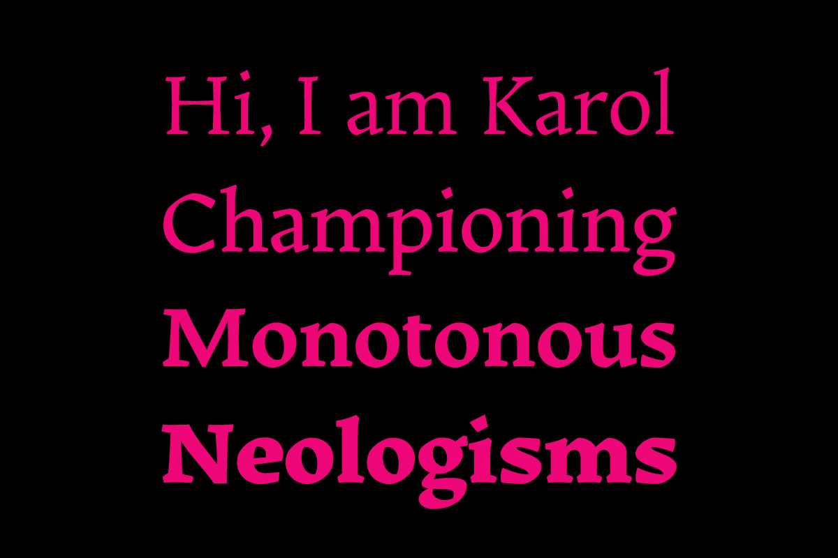
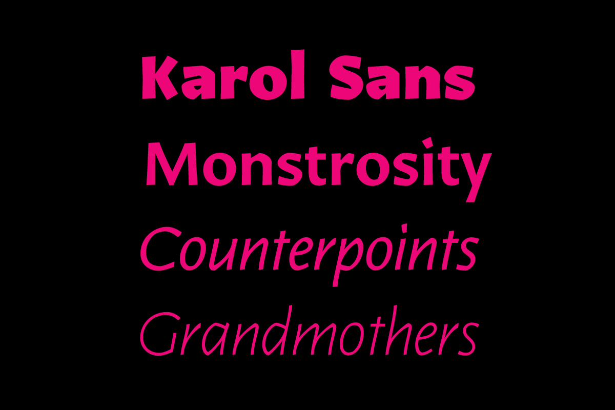
In 2011 the MA Advanced Typography course at EINA (the University School of Design and Art of Barcelona) offered Sabino the space to ask questions to which he didn’t have the answers. Taking anti-neutrality as a starting point, he looked to the visual language of German expressionism, to woodcuts and to the work of type designers Rudolph Koch and Oldřich Menhart in an exploration of the meaning of personality in type design. As Sabino describes, “I didn’t know where it was going to end up or if it was going to work.” It did work. The resulting typeface is a rich, dark mix later published as Karol for Type-ø-tones under the guidance of his former tutors Laura Meseguer and José Manuel Urós, and echoed later in Karol Sans.
“At that moment, I understood that the fractured shapes of letters attracted me a lot.”
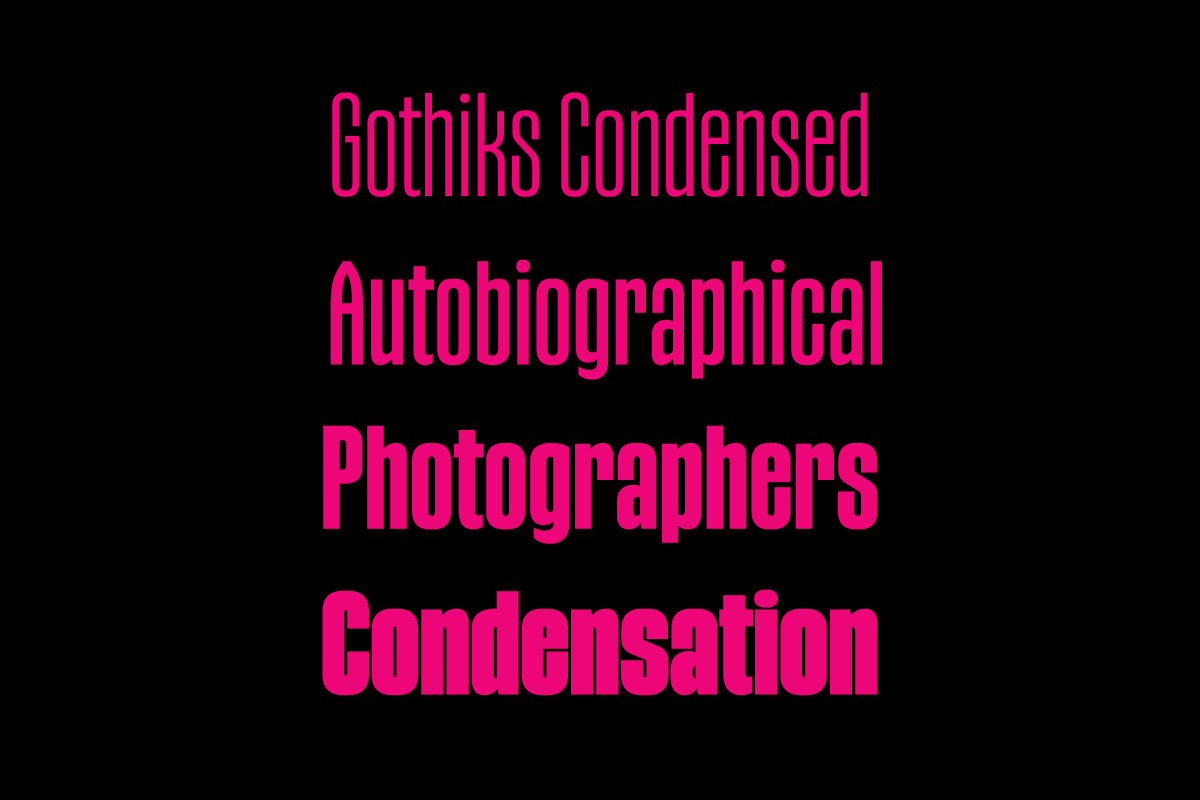
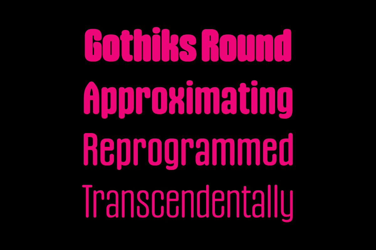
So strong was the influence of fractured forms for Sabino that upon returning to Brazil he set up his own foundry which he called Blackletra. It is a name understandable for both English- and Portuguese-speaking audiences, and which references some of the most radical personalities in the typeface canon, certainly for a contemporary audience. It was also an inspiration that underpinned many of his early designs, not least his Gothiks series and his award-winning script Haltrix.
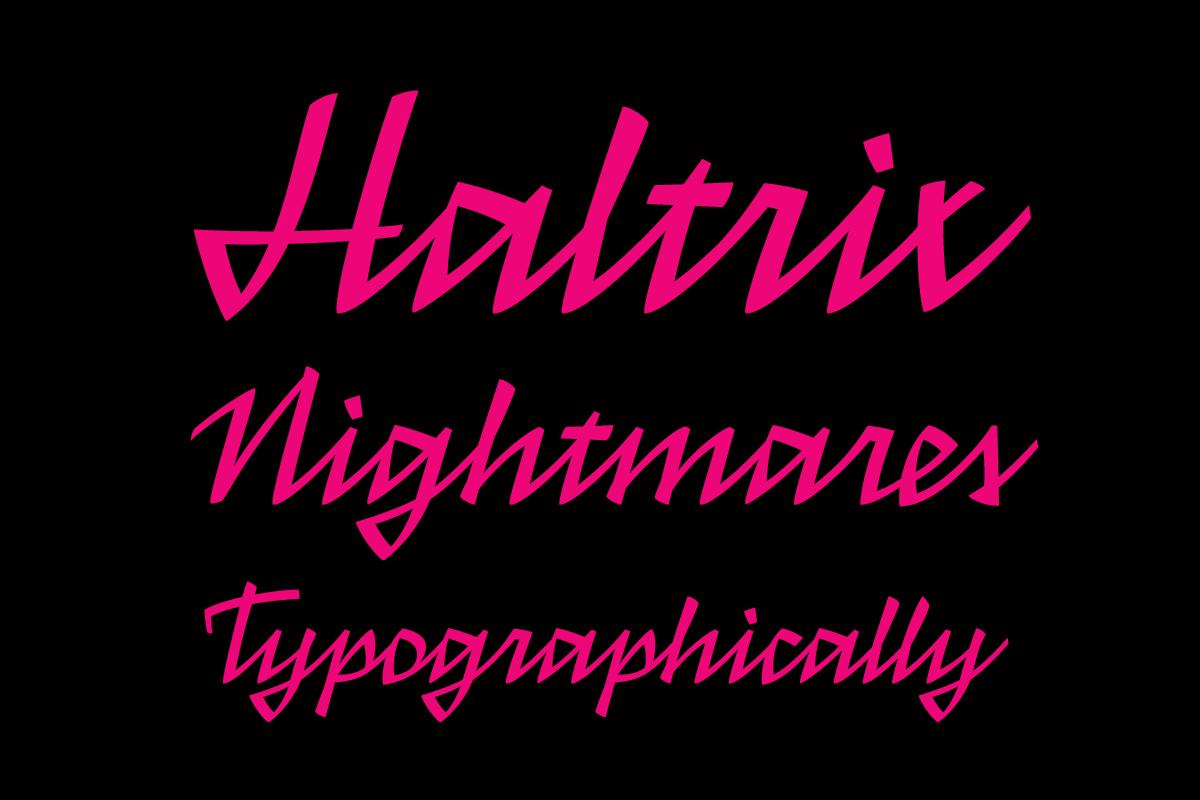
Sabino had been trying to create a new form of handwriting for himself, very fast and fractured. At a certain point his commercial instinct told him that there was probably a gap in the genre of script fonts, most of them being very delicate. And there is another influence too, which is tag reto, a form of street writing very common in São Paulo, which uses mostly straight lines. As Sabino explains, “many Brazilians often associate this typeface with this kind of writing. So in the end Haltrix is a tremendous mix of different things and references, and it was designed very intuitively.”
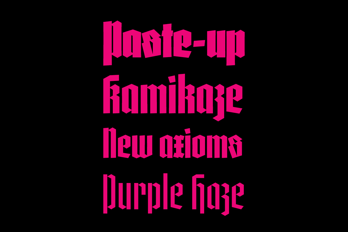
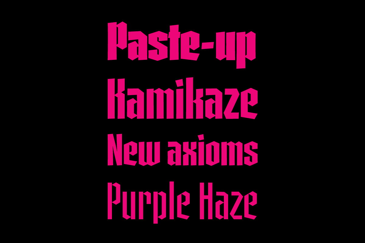
In an era when so many typefaces are smoothing every corner in an effort to be “friendly” it was a nice surprise to read of Sabino’s intention “to make the letters as aggressive and angular as possible by avoiding curves and emphasizing straight line segments.” I ask him about this intent to do the opposite of what is expected, and whether that is typical of his approach. His reply affirms that curiosity more than commerciality were important early concerns: “In the first years everything was so experimental […] I was focused on having fun and using my projects to help me learn and find answers to specific questions, like ‘Is it possible to design a text typeface that is not transparent?’, ‘Is it possible to design a script face with no curves?’ or ‘What is the difference between Roman and Textura?’, as in the case of Gandur. Type design was a form of self-teaching in those early years.”
“A certain amount of innocence and chaos sometimes is good for creativity.”
Underpinning the chaos, though, are systems. Gandur for example began life as an exploration of a strict hexagonal grid, but during its development slowly moved from a purely geometric to a more pen-based design. I ask Sabino about that point when you realize as a designer that you need to depart from the system that informed the start of a project, that logic alone cannot create a workable typeface. Was it a struggle to let go, I wonder? He replies, “It was at the same time a struggle and an epiphany! Because I don’t have formal training in design, type design taught me to listen to my intuition. We all have an inner voice telling us the path, and it is important to listen to it. But that’s a very hard thing to do when you are a beginner! Accepting that no system is perfect and that you need to create some exceptions here and there is central, and I learned that. Practice is the best teacher because the things you learn from practice, you never forget.”
The resulting typeface explores the intersection between the “free hand” and the modular grid, though as Sabino is quick to point out, “mixing calligraphy and modularity is also not an original idea.” I ask whether originality is important to him. He answers, “I try to avoid common paths when possible. If one considers originality to be ‘making something new,’ then none of my typefaces is original. My understanding of originality has more to do with a famous quote by Catalan architect Antoni Gaudí, who said that ‘originality means returning to the simplicity of the early solutions.’”
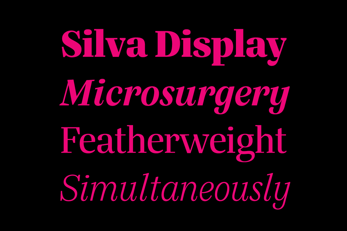
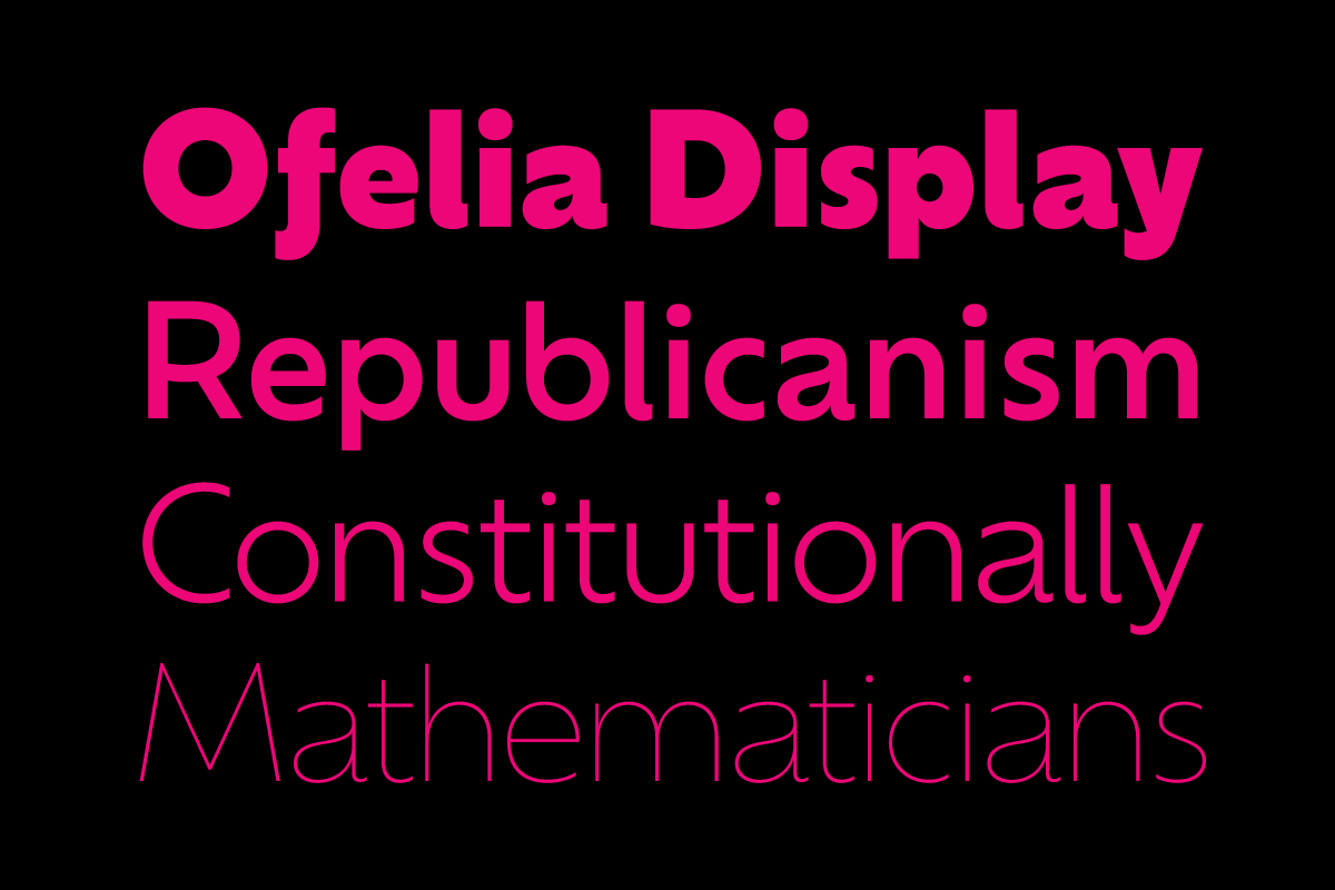
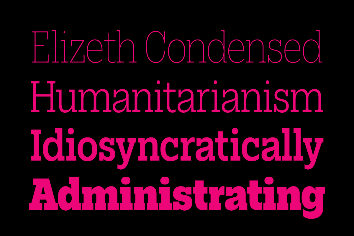
For his typeface Silva he started with the contrary idea of trying to create a high-contrast Didone style using a broad-nib pen. It is another example of starting with a system from which to break free and is a favorite of Sabino’s, not least because it has been used a lot in Brazil, so he sees it everywhere. It was designed originally with newspapers in mind and is used in Fortaleza’s daily O Povo, but it has also become popular with book designers and been used in many branding projects. He also loves the combo typefaces Ofelia and Elizeth, which were constructed as companions, and which he considers probably his most versatile designs to date.
I ask him what he would like designers to think about most when selecting typefaces for projects or when using one of his typefaces? He replies, “We have so many great fonts out there! There’s always a great one for each project you work on. As a type designer I like it most when graphic designers are bold in their type choices — that’s normally the best for the project. And of course, paying for fonts is the best way to keep them around.”